Lipton Rebrand
Print/Branding
Visual Problem
Lipton’s company values put sustainability and people first, but their current branding feels generic and disconnected from this mission.
Solution
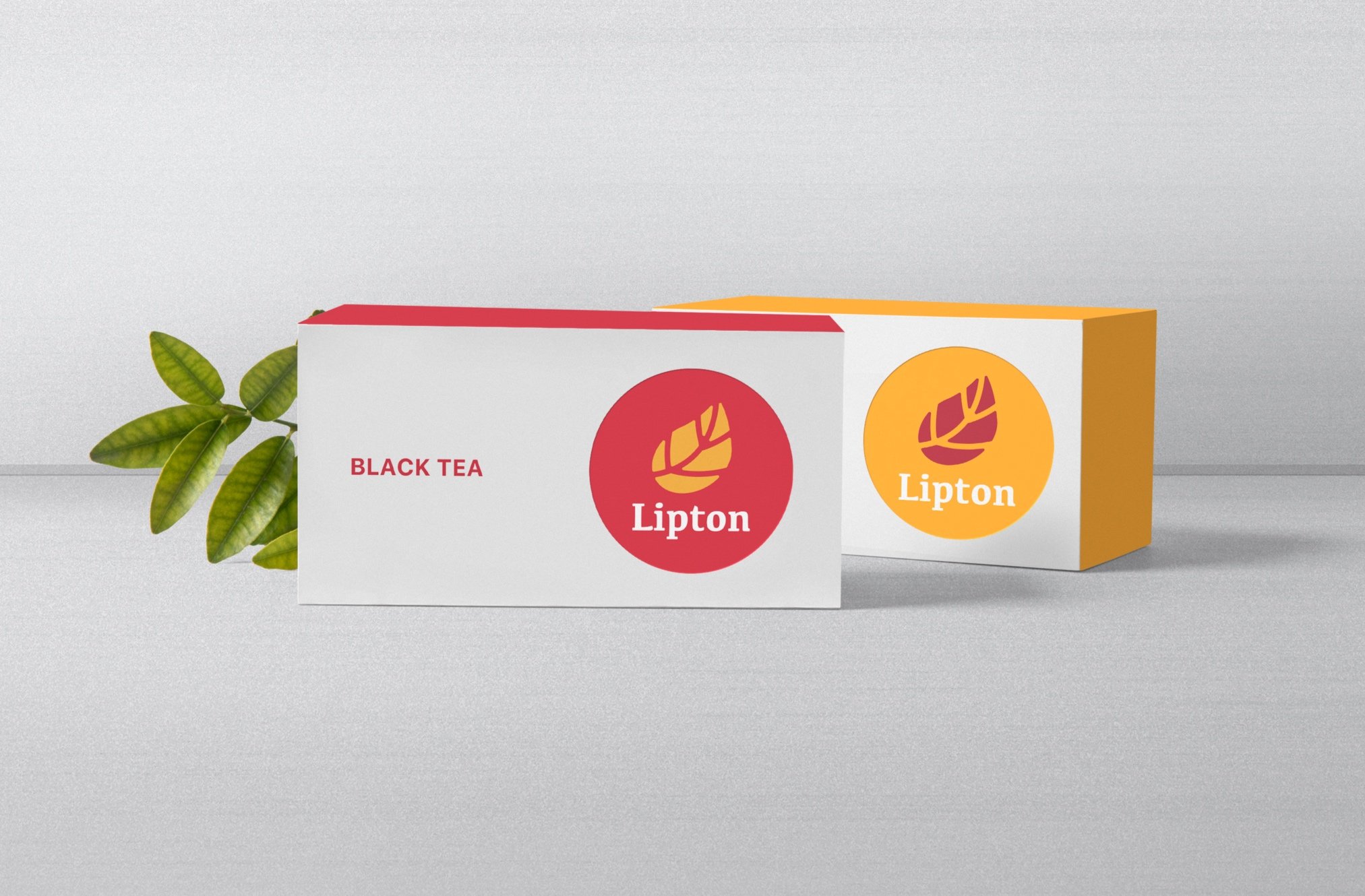
The goal of this project was to create a brand that is more connected with the company’s values, but maintain a classic look that remains recognizable.

I started with a moodboard to create a visual direction based on the project goals. I chose warm reds and yellows to stick with the well-known Lipton color palette, but move towards a warmer, earthy feel. I also added imagery to reflect the natural values and historic contributions Lipton has made in the tea industry.

Using the moodboard as inspiration, I then made 30 logo sketches with the intention of focusing on elements of nature, while also incorporating tea imagery such as tea bags and tea leaves.
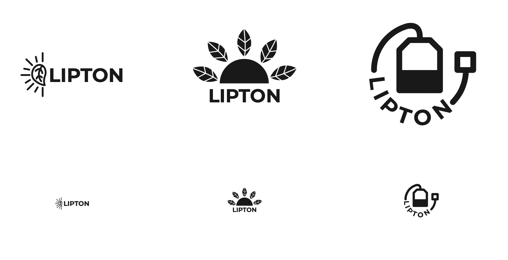
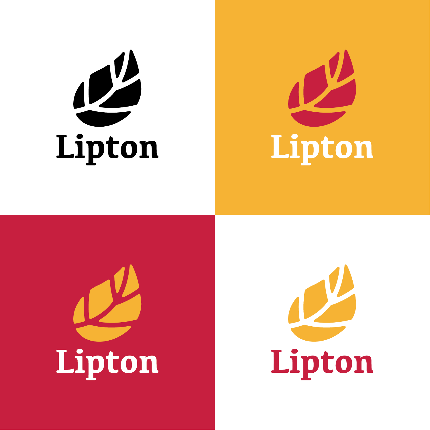
I chose three logo options to move forward with, showcasing them in two sizes to test out scalability. From here I chose the one on the left to refine further because it incorporates elements that are simple, scalable, and recognizable.

From the chosen logo, I kept the leaf, but turned it so that it curves up and to the right to represent forward, natural motion. The leaf alone is simple and recognizable, and paired with a serif font that is soft yet remains important and bold.